Interactive Navigation items in Flutter Web

What you will learn from this article?
In Flutter web it is common to implement a Navigation Bar on the top of the page. Our goal will be to create a simple web app with interactive navigation items, i.e. show mouse pointer, change text style on hovering, and highlight current selection.
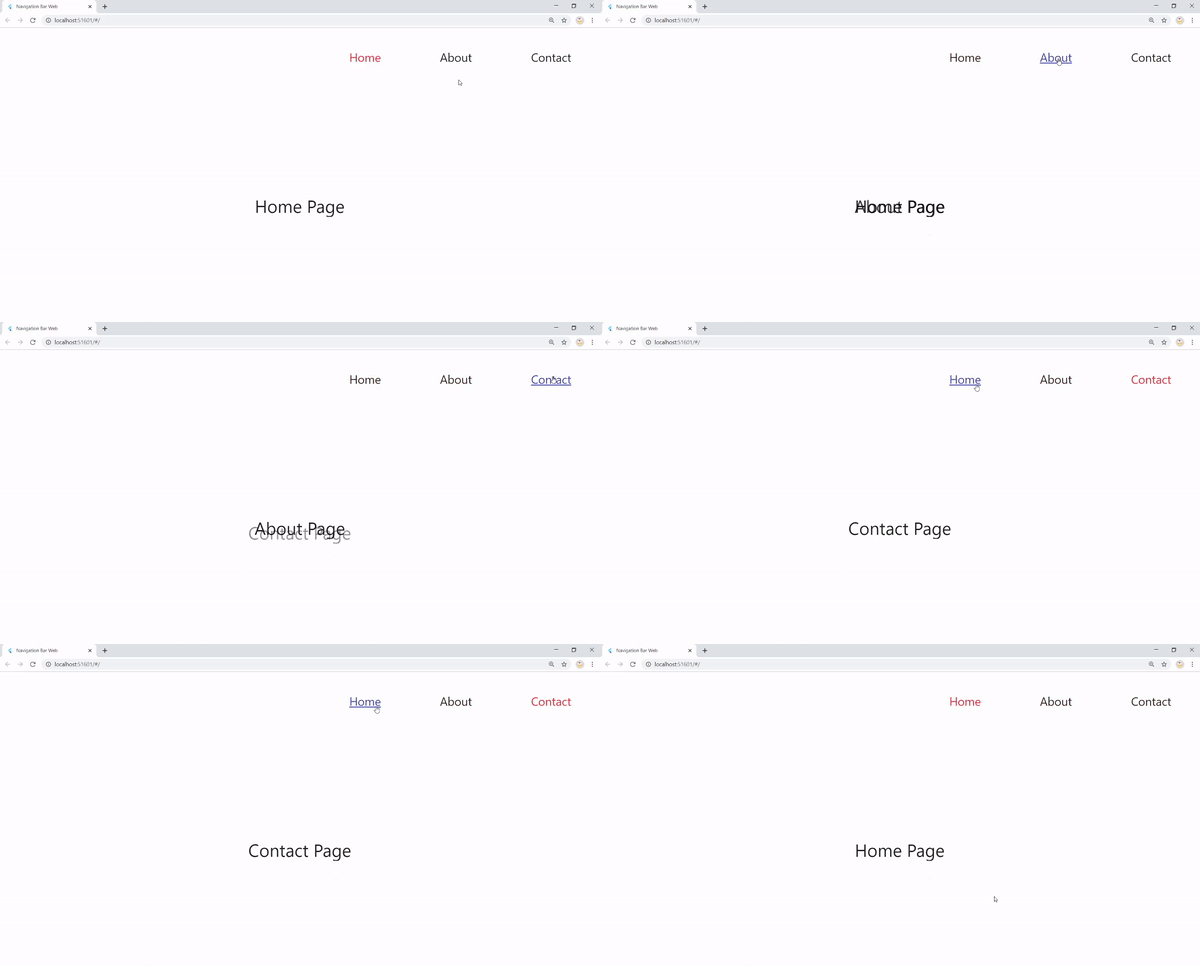
What we WILL do?
Focus on the navigation bar:
- set a basic UI
- enable navigation
- make navigation bar interactive
What we WON’T do?
Pass data between the pages, use services, and ViewModels.
Step 1: Plan
The first step is to build a code structure (a skeleton) and to collect everything that we will need.

- ui package: Home, About, and Contacts screens
- routes package: routes names and destinations generation
- widgets package: navigation bar UI and logic classes
- constants package
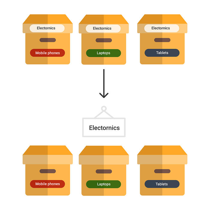
AppView class is the container of the app, it defines the whole application view, logically split into a static navigation bar and dynamic content.
Usually, we would set a navigation bar separately for each page, which means that it would be recreated on each screen, but it shouldn’t be the case for a real website.
Want to read this story later? Save it in Journal.
You can image this class based on the example with boxes below, where “Electronics” is our navigation bar.
And at last, we have the main class — a starting point of the application:
Step 2: Implement basic UI
For the UI we have three pages: Home, About and Contacts, so let’s set a Text widget to distinguish between them when navigating:
Repeat the same for the Contacts and About pages, only changing the text for the current page’s.
Step 3: Navigation Bar
Let’s create a new file called navigation_bar.dart under the widgets package.
It contains 3 Text widgets (3 destinations), but to avoid boilerplate, create a new class navigation_item.dart to keep the Text widget there:
We need a String title property to pass the name of the navigation item (“Home”, “About” or “Contacts”). Now instead of the Text widget, use NavigationItem in the NavigationBar:
Since we have our pages and navigation UI part ready 🚀, we need to unite them under one container:
As we agreed previously, AppView class plays the role of such a container. Inside the Colum, we construct our view, where NavigationBar will stay unchanged and Expanded widget takes a child widget which will dynamically switch between HomePage(), AboutPage(), or ContactsPage().
At this point we should also update our main class:
We use the builder property and set AppView passing the child. The child will be passed by the routing system that we will set up in a moment. If you are not familiar with builder property I recommend to read more in the following answer on StackOverflow that explains it concisely and nicely.
Step 4: Navigate
Let’s modify our routes classes. We need the following: route names, map them to a certain page, and a global key.
In the routes.dart:
In the router_generator.dart:
Instead of the TODO in the main class in the code example above, we now use an existing onGenerateRoute property to set up our routes:
Okay, why do we set a key? To put it simply, we need to navigate without having a context, later it will be useful if you are implementing a service and in this case, it is also necessary since we have a complex widget tree structure impleading AppView, You can learn more about it in a great tutorial by Dane Mackier.
After launching the code now, you notice that nothing happens, it’s because we didn’t implement an onTap() function yet, so go back to the NavigationItem class and inside the build method wrap the whole widget inside the GestureDetector:
For navigating, we need a couple of small changes. Inside the onTap() we can use a pushedNamed function and pass the name of the route we want to navigate to. To obtain it, create a new String parameter in the NavigationItem class called routeName. Now in the NavigationBar class associate each NavigationItem with a specific route name like so:
Everything is ready, so replace TODO in onTap() function and navigate:navKey.currentState.pushNamed(routeName);.
Step 5: Hovering effects
It’s a common thing on the Web that interactive items on hovering, are identified as clickable elements. Generally, two things are performed in this case:
- showing a pointer
- changing a text style
Step 5.1: Pointer 👆

Let’s create a new widget InteractiveNavItem that we will use instead of a simple Text widget in the NavigationItem.
Voila! the pointer appears now.
Let me clarify a few things. You will need an html dart package, I recommend to use universal_html, that would be useful in case you decide to make your app responsive on mobile, where html is not supported, so it’s necessary to use a cross-platform package such as universal_html. To detect the mice movement, we extend from the MourseRegion widget, that allows overriding such function as onHover and onExit. All that we do here is just changing a cursor from default state to pointer in onHover() and back in onExit().
Step 5.2: Text Style 🥞

For adding text effects let’s create a new widget called InteractiveText to use inside the InteractiveNavItem.
Here, same as before we apply the MouseRegion and set a hovered state to true or false for determining whether the text should change the style or no. Since we are tracking the state, the widget should be Stateful. For convenience, I defined a default text style as a constant final TextStyle kPageTitleStyle = TextStyle(fontSize: 20.0); in the constants.dart.
Now inside our InteractiveNavItem, we can pass the InteractiveText instead of a simple Text widget:
Step 6: Highlight current location
It’s a tricky one. The goal is to change the text style of the selected page in the navbar, once the user navigated there.
There are probably several ways to do it, but here is the one I found.
In short, it will work as follows: we introduce a new boolean that is equal to true or false based on a specific index. Each item in the bar has an index and when an item is pressed the index is changed to the current’s page index which sets this specific item to true.
This way to perform a text style change when an item is selected, the following steps are needed:
NavigationBar class
- For the NavigationItem define a new bool parameter selected
- Set selected to true for HomePage when the index is 0, for AboutPage when the index is 1, and for the ContactsPage when the index is 2
- Create a function to updated this value and pass this function as a parameter of the NavigationItem
NavigationItem class
- Call onHighlight(routeName) method in the onTap function
InteractiveNavItem class
- Create a new parameter called selected and pass selected value from the NavigationItem class
- Based on the selected value change the style of the item when it’s pressed.
So you can see in the style property is where we are setting three different Text appearance, depending on when text is in default mode, hovered or selected.
TADA, we’re done 🎉
You can use this code and further develop your app.
The full source code is available on my Github.
I’m curious about your feedback, on how it worked for you, and how you think it can be improved 🙂

More from Journal
There are many Black creators doing incredible work in Tech. This collection of resources shines a light on some of us:

